
Until recently, a Power App was designed as a landscape ‘tablet’ mode app used on desktop windows, or a portrait layout ‘mobile’ mode designed for phones on a smaller canvas. When you wanted to design a functionality that was used on both a desktop and a mobile, you either had to live with a big chunky vertical one on your desktop, a smaller hard to read horizontal one on your phone, or duplicate the work and build two versions of your application.
Some of the dedicated developers found ways to mimic a responsive design with complicated formulas that checked the width of the screen, and changed position and size percentage variables; however this method was incredibly time consuming as each and every element needed to have complex ‘if this than that’ formulas built into their visibility, position and size.
Microsoft have thankfully announced some new functionality which will make the availability of responsible Power Apps, that are much more achievable. We can now add containers which will automatically move around together when the screen width changes. this means there is still a bit of work to make your existing Power Apps responsive, but any new Power Apps can be arranged into containers from the get go.
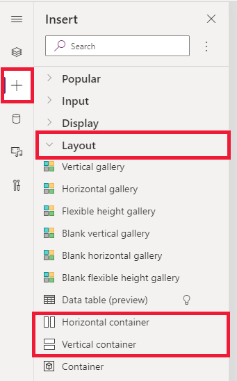
In order to get started you will need to select “Insert” on the sidebar, under the Layout category to insert these controls into the canvas. The container control with manual positioning is also in Preview. In order to enable your app behaviour to be responsive, navigate File > Settings > Screen size and orientation, and turn off the Scale to fit setting.
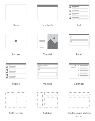
In addition, Microsoft have also introduced three new screen templates prebuilt with these responsive containers, including a Header, footer, main content layout, split screen, and sidebar layouts as per below:
Users can select “Window size” in order to resize their app before publishing to view resize behaviour.
For more details, refer to our documentation on responsive apps.
Have you tried out the new layout? Let us know below your thoughts


 1300 228 744