Have you ever left a meeting/ presentation more confused than informed, wishing you could simply review information in your own time, in the form of an informative, user friendly dashboard? Well this is where Power BI dashboard enters the room!
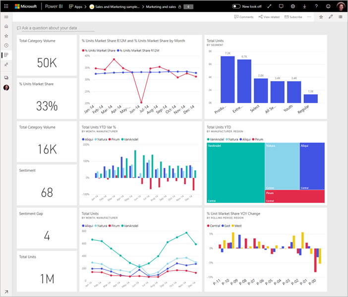
A Power BI dashboard is single page (also commonly referred to as a ‘canvas’) that uses different visualisations to convey information, but what are some things to consider when making a dashboard?
Listed below are 5 tips on ensuring your Power BI dashboard is conveying the right information, effectively to its readers.
1. Audience/ Target: Who will be utilising the dashboard? Have a key audience in mind when designing the dashboard. What are some of the key elements that a user will need to gain from the dashboard in order to make an informed decision?
2. Keep it clear: Ensure everything is able to be viewed at a glance. What will the dashboard be used to convey? What information is best suited to be displayed in order to assist the reader/ user?
3. Keep it simple: Simplicity is key! A simple, clear and concise layout keeps your dashboard user friendly whilst remaining extremely informative and resourceful. Data and graphic visualizations should be easy and simple for a user to understand, be sure that the use of titles and labels are clearly available to assist the user with reading the information/ data.
4. Keep it consistent: Remember you’re telling a story with the information/visuals on the Power BI dashboard. In order to keep a consistent dashboard, reflect on the first 3 steps of understanding your audience, keeping the information clear and above all, keeping it simple. Consistency with all of this is the key to ensuring the readers are able to gain knowledge and not leave the dashboard more confused and uninformed!
5. Look at the overall picture: Make use of the visualisations. Bar charts are standard practice for looking at a specific value across different categories. Gauge charts are a great way to show the status of goals/targets. Whilst the use of visualisations are a great way to display information in a clear, simple and concise manner, it’s equally important that you don’t clutter your dashboard with too many graphs and overwhelm a reader.
Let us know in the comments below if you have used or would be interested in trying a Power BI dashboard!




































 1300 228 744